

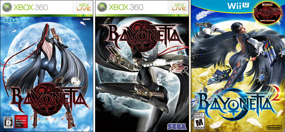
I hate the logo of WiiU ver. Junk. RT @SEGAbits We love all three Bayonetta box arts, but which one is your favorite? pic.twitter.com/CZedgSqcNc
— 神谷英樹 Hideki Kamiya (@PG_kamiya) June 10, 2014
No. They did it without any permission. RT @SgtAdam As supervisor of the game, you don't have control over that?
— 神谷英樹 Hideki Kamiya (@PG_kamiya) June 10, 2014
Platinum Game’s outspoken designer Hideki Kamiya has revealed on Twitter that he strongly dislikes the logo on the Bayonetta 2 boxart. When questioned about it he said that he didn’t have any control over it and wishes that he had.
Thanks, Jack
Kamiya Xbot corrupted confirmed…
Kamiya being Kamiya. hahah
Yes, I can’t take anything this guy says seriously.
Not even.
He managed to get Bayonetta 1 bundled with Bayonetta 2, alongside exclusive costumes and weapons.
Definitely not corrupted.
He just doesn’t like the logo, that’s all.
But why? Because it is blue? Because it is not Black with red? Because those seem to be the only things that are diferents between the logo of the 1st game and the logo of the 2nd game.
what an obnoxious pleb
Kurisu, did you enjoy the empire’s conference?…
Shut the fuck up you stupid bitch and stop complaining about your fucking period.
-woah-
I am sorry, I am a complete and total retard with dumbass opinions that I think are facts I am also a sexist faggot.
*Donko claims to be intelligent*
*Donko says the most stupidest and clueless statement that only men who have no clue what a period is and would say that if they were to complain about it*
*Donko has been proven invalid. Point proven, my pencil is sharper.*
*Donko confirmed his own destruction*
wtf is a pleb? 0-e
I can see why he’s upset. I guess the Wii U version lost out again….*sigh*
Then just ask them to change it? You don’t have to be a little baby over Twitter whining about it. Either way, still getting the game with or without the new/old logo. Who cares?
Actually, SEGAbits asked him while posting the phoyo, and he gave an honest reply.
*photo
fuck off Kamiya
Harsh much? It hardly looks different.
but it looks great. she looks great.
Actually, if he read the tweets, he says he loves the artwork, saying “Of course the art is good. Cuz we made it.”
He dislikes the logo itself, which is just a blue version of the original Bayonetta logo (which could be found in the top right).
How the hell are you guys making this Kamiya’s fault?
Oh welcome!
Wonder what about it he hates…
Damn.. that dude is always winning about everything. =/ Hate that dude. Love what he doing with the games but… he’s like Patcher. sometimes.
Indeed, did you see the Xbot conference?…
He was so uttertly irritated the whole time he was up there…
I mean really, is he 6 years old?…
Yeah yeah, he was like “Damn i hate to be here”, wtf dude =_= he’s an asswhole. Is he’s job to be gentle, happy, etc with games. He’s just gaining a bad reputation.
And most importantly, he should be a proffesional…
Exactly!
Every week i think he talks to fans and respond in bad terms. -_-
Anyway…
…I don’t see the difference other than a color change and the circle in the middle, the butthurt is strong today.
I think he meant just the box art in general. The title is a bit miss-leading :P
No, he said he loved all three box arts, but doesnt like the how “Bayonetta” is displayed.
ah, you’re right. My bad!
What he must be hating is how the heck they change the Long Hair from the character, because i think it sucks now.
Kamiya is God.
I like the box art
For me it’s the best of the 3. I wonder what he doesn’t like about it?
Probably because he is a satanist and it doesn’t look devilish enough or something…
….ok?
lol so professional of you, you hypocritical piece of crap. oh and go bash on other people for not posting facts in their comments, but it is okay if you post baseless retarded shit about kamiya being a satanist.
They removed the crescent behind Bayo & put full moon & changed the color of “2” in red. JUNK. RT @clefairyirl what would you have done diff – from Kamiya’s twitter
I don’t really see that big a difference, but eh, that game is kind of his baby so of course someone changing something would anger him.
yeah, I understand him being upset, I would probably be a little peeved if someone did something like this, but he talks as if the game is ruined, haha
hum, I like more the wiiu logo, it’s less poluted in my opinion
He wasnt referring to the wiiU logo…. he was referring to the Bayonetta logo
sorry i meant the wii u bayo logo, not the wiiu logo
I personally like it. Kamiya needs to quit worrying about it and focus on Scalebound.
Nope, he should stick scalebound on the back burner and publish some more stuff for the wiiU.. ;-)
Nooo Scalebound looks awesome. It’s easily one of my favorite E3 reveals so far. Platinum games is doing an amazing job, both on Wii U and Xbox One.
I don’t really get what he doesn’t like. It would help if he was a little more specific…
Agreed. When I first read the tweet, I was trying to figure out what the fuck he was whining about. >.< He's complaining about the way the title of the game is shown on the box art.
…Was that really worth posting ?
He’s talking about the “moon” logo? I find it very well suited for the new changes in the game. In fact the first trailer began with that, it link us to the game visually.
They are going to talk about X now…
really? well that fucking sucks that they did it without his permission….
logo? the wii logo at the top or the title or the thing in the top right or her?
He just sounds really bitchy about it… It’s annoying actually
Well that’s the way he is. I forgive him, because he IS the one who gave us Bayonetta afterall…
Man, this guy is so whiny. It’s gotten really annoying.
the fuck?
looks the best out of all those 3
he should stop whining so much, usually a decent enough guy
I like the red one better, but that is because I think it fits Bayonetta better.
I think overall, the boxart still looks really good. It will catch the attention of anyone interested in… you know ;)
it looks the best to me
He wants it in red plain and simple
Looks best in blue to me.
At first, I was trying to figure out what the fuck he was whining about. But after reading some posts, I discovered it was the way the title of the game was designed. I don’t really blame him, though. If this was my creation, I’d be pissy about the box art too if it wasn’t what I had in mind.
The red logo would work better with the yellow/gold moon, with crescent or not, but wasn’t that blue logo already out when they made the videos and announced the game? What’s ugly is that big circle about Bayo 1, why can’t they make it appear seamless at the bottom of the box art?
Anyway, I still want one and hope they work on more Wii U games in the future…
I think the new one is better. It’s more legible and aesthetic from a designers point of view. I think he is just upset because it is changed and he was hoping for it to stay the same.
I kind of understand where he coming from and I also respect the dude to be honest about it. At the end of the day someone asked about his opinion and he replies honestly.to be fair I don’t think that will damage his relationship with Nintendo as long as the game sell well and they promote his game the same way the do with 1st part game…. no scratch that better than they do. I like his passion and he delivers good games I will gladly play a vanquish rather than a COD.
I personally like the blue logo the best though.
what they should do is add the bayonetta cover on the flip side of the bayonetta 2 cover… so you can just reverse it…..when you want